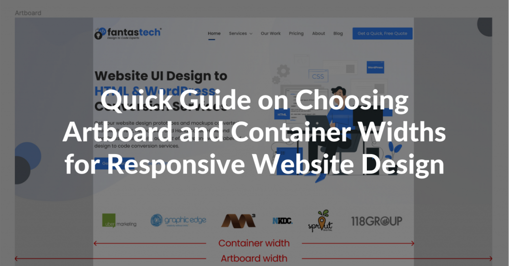
Update: New version, 2.0 Beta 2, is available. Read the announcement here and then head to that release post, too. This badge bellow will install the newest version anyway. Enjoy!
Hello everyone!
Here it is, that day, the big one, the one I’ve been looking forward to for the past few months. I worked a lot and it’s been too long, but I’m surely proud of this release. Not because of all the new cool stuff that got into, but rather for the state I finally managed to achieve quality and consistency wise. But more about this in the official release, in a few weeks.
Please upgrade your Flash Player 
Warning: Please back up your projects before opening them in this new version. Thanks!
Now, let’s see what’s new and awesome:
New User Interface Layout
FlairBuilder got itself a makeup and it’s now prettier and, more important, easier to grasp and use, especially for first time users.
Most of the controls in the Properties panel have moved to a top toolbar with more compact, visual and intuitive controls. Take a look!

NEW: Now you can select a specific font face for a control that supports it (most o’them do). This is huge! Lots of new possibilities here.

A new color picker. Larger palette, easier to use and, specially, easier to input your own color code. The old one was a drag.

Some of the options have gone or transformed. I talk about, for instance, the Grid options like row colors, scrollbars. Scrollbars are a must so I’ll added them back, for sure. As for the row colors, I’m not sure yet how should I put them back in the new context. I need your HELP here!
Better Interactions Everything
Quick, as in super fast, link to other pages set up for all controls that support mouse click. This is, again, HUGE, and will make your prototyping many times faster. It’s now as easy 2-3 close clicks to set a link or to change it. Take a look and try it yourself.

The events panel has moved into a floating popup, which can be opened from the toolbar. It will not be opened by default. Not sure if this is a good thing, but I wanted to clear up the interface a bit. Too many options upfront might make learning harder, isn’t it?

The new interactions popup also contain some of the controls related to interactions, such as the name of currently selected component, its position, whether it’s visible or enabled.
Then the usual interactions tree, for each event and case.
NEW: A new interaction in this release is ‘Move/Resize’ a component. It’s a duo, meaning that you can set up both moving and resizing of a component in one shoot. And, the sweet part, you can make an animation if you want. Just tell it for how long, in seconds, and FlairBuilder will animate both the resizing and repositioning. This is AWESOME, if you ask me! 

NEW: A long requested feature has been a form of autocomplete for behavior cases. When you have a complex component like a Button Bar, Link Bar, Tree, List, Tabs etc., you can make a case out of each item in that component, and specify actions for each. Now you don’t have to remember which is what, because FlairBuilder will give you a list of option. I guess that it’s not a gear shifting feature, but for sure it pumps the gas a little bit!

Simpler Component Palette
The icons for components in the palette are now big. Really big. And I hope they are more intuitive, too. I crafted them myself, so they could hurt the eyes of you designers, so feel free to critique.

There are fewer icons, too. Don’t worry, all components are still there. It’s just that several components have been merged or transformed. Take, for instance, the carts. Now there’s a single chart component that supports all 4 variants: Bars, Columns, Lines and Pie. The same with Horizontal and Vertical Slider, merged into one component. You can choose the variant from the new Style button, as I call it. Always look for it near the Events pop-up button, to the far right side of the toolbar.
The geometric shapes, rectangle, ellipse, vertical and horizontal rule, pointy rectangle, triangle, have been removed from the palette, and now they stay at the top. Handy, isn’t it? Triangle will be gone, but now you have the Polygon Line shape. Which is like totally AWESOME. The caps and bold are like totally mine.
In other news, the Tabs and the Accordion have been completely re-written. They are 100% customizable right now: border, background color, font face, color, style, text alignment, everything. Plus the custom icons which are, of course, now supported. I so happy about this! They were so inconsistent with other components, and I felt so miserable about it for so long. Too long, but it’s finally gone. The misery. Take a look!

Oh, oh, oh! And check this out! The Accordion header height and Tabs height/width are now customizable thanks to these yellow handles. You’ll notice them in other controls, too, like for rounded corners and paragraph line height. It’s so much easier and straightforward to work with them. Check. Them. Out!
And I’m not done yet! Not at all.
Design Stage Improvements
So, starting from the top left corner, all page settings like size, master, grid, have moved into this collapsible panel near the Page title. Check it and let me know what you think! I beg you. 

Rulers and Guides
Requested for a long time, it’s finally here. It’s not done yet, cause I need you feedback! There’s a known bug, where the top horizontal rule doesn’t refresh when you come back from Preview mode. You have to nudge the scrollbar a little.

The horizontal and vertical guides are incomplete. They will not be remembered upon restart. That’s because I have a design problem and I NEED YOUR HELP on this one, too. Basically I don’t know if I should make the guides per page or per project. Hm? What’s your take?
Better resize/reposition handles
Inspired by Google Docs Drawing app (like in case of other features new in this release), I’ve changed the handles. Now they are round and there’s now a yellowish border which lets you clearly see which are the margins of the control. Plus, whenever you resize or move around a component, the handle will hide so you’ll clearly see the surroundings and be more precise on your action.
Component Groups
I want to make component groups as editable as possible, so you won’t have to keep on grouping/ungrouping them for small changes. So now groups are resizable. Plus, there’s also a first attempt of letting you edit the content of the group. Just double click one and see what happens.
Tons and tons of bug fixes
I don’t even remember the full list. The bottom line is: if you every reported me a bug, it’s most probably fixed. You can check and if I forgot about it, it’ll sure get fix before the final 2.0 release.
However, there’re still some major issues like Export all snapshots… Which I’ll try to address, somehow, as soon as possible.
As for future plans, I’ll keep them for another post. I’m tired now and the weekend is coming!
Thanks everyone for your patience, will talk to you really soon.
Have a nice weekend!